When you are a beginner, you need to know
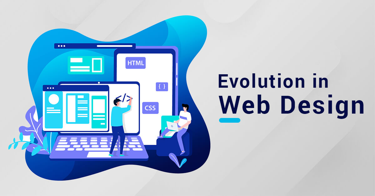
that over the past years, the whole web platform has changed drastically from
desktop to mobile. It looks appealing when it comes with proper screen
dimensions to any devices you like. So with responsive website design, you can
do this. But if you are a greenhorn, it might be befuddling for you. But at
this time responsive web design can lead you to more conversions and growth in
business.
What is responsive web design?
Responsive web design is a method that
allows your content to adjust to different screen sizes without compromising
the quality. As PC screens are large, you can segregate your content in
multiple columns. But if it is for mobiles, then users may feel distracted to
read such content divided into multiple columns. So you need to consider this
thing while designing a website.
Responsive design enables you to provide
different information and design layouts to different devices dependent on
screen size.
What Is the Significance of Responsive
Web Design?
If your visitors can't read or navigate
your site quickly on any device, they'll tend to give up. A key objective for
any website is to provide a great viewing experience for users. One technique
to attain this is through responsive web design. Because of responsive web
design, your users will have a better time accessing and surfing your site. Let's
have a look at the main elements of responsive web design. They are segregated
into three categories:
1. Adaptive layouts
Creating a site with an adaptive layout
that can be restructured and scaled to fit different screen sizes and
dimensions.
This is the primary step in constructing a
responsive web design. The measurement of such an arrangement is not fixed. The
whole thing is scattered in comparative percentages to meet the requirements for
each device. If the browser is drawn out, your layout will respond fittingly
and span the required width.
If you wish to convert any fixed layout to
a grid layout, you'll need to utilize your calculation abilities to split the
target and use the r command.
2. Adaptable images
At first, images, as well as other media
files embedded in your website, must be ascended as the device or its
resolution modifications.
The second vital feature to dredge up is to
devise flexible or responsive media files on your website. If your site's
images aren't receptive and you have a fluid layout, you may face some issues
in the future.
Adaptive Images is one of the further active
approaches for making images adaptive. You can use the CSS to resize the
browser and its image to 100%.
img {
max-width: 100%;
width: 100%;
}
3. Querying the Media
A media query is a CSS3 feature that allows
you to modify the rendering of information to different criteria such as screen
size or resolution.
Now that we have a dynamic layout and
flexible media files, we can also use media queries to integrate everything.
When a given device screen size is detected, these are fantastic CSS settings
that tell the web browser which web sections will load.
There are three types of media queries for
smartphone, pc, and tablet screen resolutions. 320px, 600px, 768px, and 1280px
are the most often used screen width choices to fit these screen dimensions.
Use this command below:
@media screen and (min-width: 780px) {
.full-width-img {
margin: auto;
width: 90%;
Responsive Design Units and Values in CSS
CSS uses both objective and subjective
measuring units. A centimeter or a pixel are examples of precise length units.
The size and resolution of the screen, as well as the font sizes of the root
element, determine comparable units or variable values.
For responsive design, PX vs EM vs REM vs
Viewport Units
·
A single pixel is measured in
pixels per inch (PX).
·
EM — relative unit dependent on
the element's font size.
·
REM – relative unit dependent
on the element's font size.
·
VH and VW are percentages of
the viewport's height and width, respectively.
·
Percent – the parent element's percentage.
Because pixels are the most straightforward
unit of length in CSS, a rookie web designer or developer should typically stay
with them for text. However, when it comes to selecting the width and maximum
width of pictures and other items, the percent is the ideal option. This method
ensures that the components adapt to the screen size of each device.
To recapitulate, a Responsive web design agency integrates
some distinctive features. So if you don’t have an idea about what is HTML or
CSS it might be confusing for you and it can be full of errors.
However, by acquainting yourself with the
number of components, learning the examples with web development implements,
and testing your website as you run with the trial code, you should know how to
make it responsive without any great concerns.

Please fill our form so that we are prepared with as much information of your project as possible. You can expect a reply within one business day.
 +91 8981313005
We are all ears, waiting for you Give us a ring or email


© 2008 - 2023. Bhavitra Technologies Pvt. Ltd. All rights reserved.
CIN - U72300WB2015PTC207104


